In the beginning of 2013 I started designing foundation paper piecing patterns. My stash was kind of limited at that time, so my test blocks were made with all the same fabric. It left me with several block in a similar orange-brown color way, cute, pretty… but they were still in my cupboard since 2013…
This year I have set myself a task to finish my old abandoned projects, or give at least give them to another quilter. So far I have been able to finish a few projects and they have left the house already! Some projects were just an idea based on some left over blocks like my test blocks… which then turned in completely new projects… HA HA HA! How I manage to get myself into trouble!
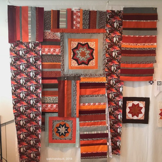
Three leftover test blocks are suddenly turning into a large wall improv quilt for my living room. At the moment I am interested in learning more quilt techniques and improv quilting was on my wish list. So I am doing my best with this first big improv quilt!
I bought a couple of books on the topic and so far I am following the chapters in ‘The Improv Handbook for Modern Quilters’ by Sherri Lynn Wood. Sherri explained how to use patterned fabrics and solids together in one project.
The fabrics from my stash were cut up in various random widths and sewn alternately (solid and patterned). Its was very liberation just to cut up part of my stash and start sewing without a more detailed plan than to sew the strings together.
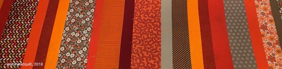
I used all kind of orange, burgundy and brown fabrics with some grey and light blue accents. Some of these fabric even date from 2013 too! Happy to use them up as my taste in fabrics has changed a bit.
When looking at the first picture in this blog post, you might see that the stars really stand out because of their different shapes compared to the vertical and horizontal stripes. I decided to have the pointy shapes of the stars be repeated in the quilt, so I put large triangles in.
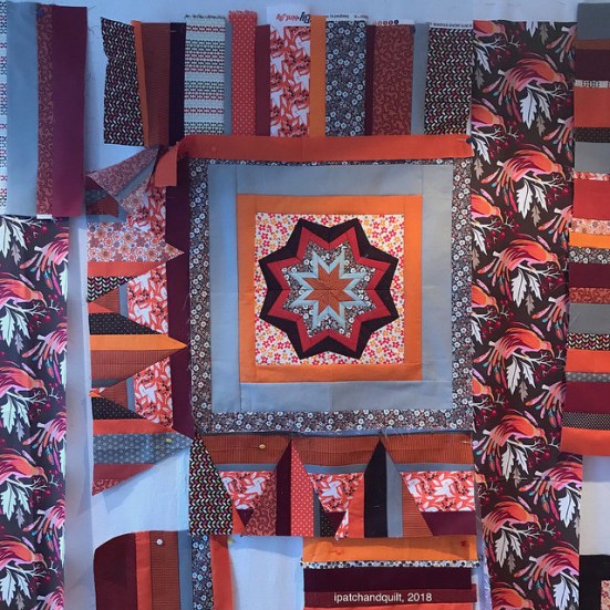
Filling more gaps and moving some parts around…
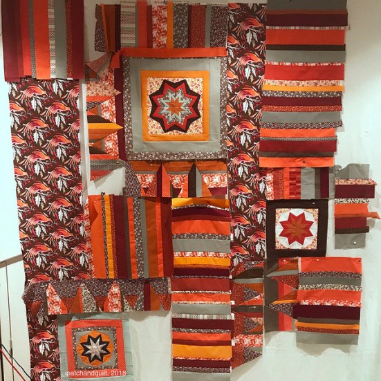
At this moment this quilt is still in parts because I feel it is not finished yet. New fabrics have arrived as I ran out of my solids and the quilt needs to get a bit wider for the wall it is destined for.
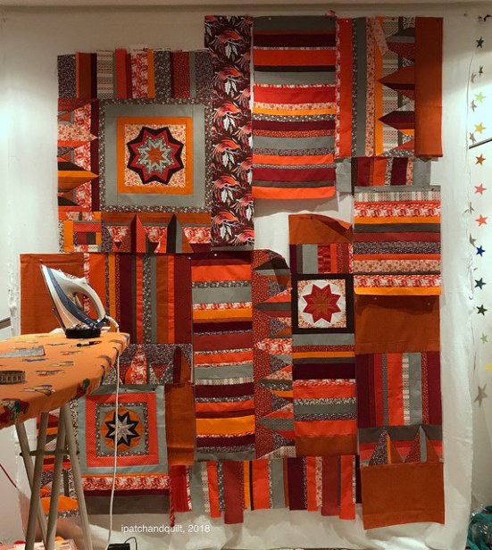
I am still undecided about the single large vertical piece of patterned fabric with the birds on it. I feel it adds the necessay white accents that one of the star blocks also has. What do you think? Leave it in, take it out?
Is it the quilt too structured? Do you think I should take the star blocks out and just work with the improv elements?
Improv is hard on the brain, you know, ha ha!
Hugs
Esther


One of the things I like about the quilt is the mix of the precise paper piecing and the looser improv; keep the stars. The print fabric you mentioned tends to draw my attention more than i think you want it to. To my eye there is enough light to go with the lighter star. That star serves as a nice focus, I think.
Hello Claire,
You are right, of course! 🙂 I will experiment with a smaller piece of the bird fabric. I will keep you all posted about the progress.
Hugs
Esther
Regarding the long strip of patterned fabric: if it’s not working, cut it smaller. Piece it into some blocks and join to make a strip the size you need.
Hello patricia,
Thank you for your great advice! I will chop up the bird fabric and see what happens.
Have a lovely day!
Esther
Hi Esther, I would balance the print at the top of the quilt with some in the bottom half. Keep the mix of structure and improv, I think it gives the quilt movement and character. Also I would try to break up the 2 solid pieces at the bottom right, perhaps some of yourovely quilting in a contrast thread?
Hello Pat!
Yes, you are right. That busy pattern needs to be repeated somewhere, maybe in a cut down version. And of course, there will be a smothering of quilting later on, ha ha! I am not afraid to use a contrasting thread. I have nothing to loose, as this all a learning experience. Thank you for your advice!
Bye bye
Esther
I have to agree with the prior comment…love the modern mix of paper pieced blocks and the improv, but the print fabric with the white is the first thing my eye is drawn to. The star with the white doesn’t dominate, but blends well with the surrounding blocks. If you wanted to include the print fabric to include more white into the quilt, cut it in strips and include it with some of the remaining blocks…just cut it small as it is really eye-catching.
Thank you for your great tips about the flashy bird fabric! I will experiment with some smaller pieces of it and see what happens! Thank you for helping me out!
bye bye
Esther
Esther, what fun! I think you should keep those stars, and also the large scale pattern, but as Claire has said, it does draw the eye. In your position, I’d put it lower down, at the bottom of the quilt, and perhaps horizontal, to ‘anchor’ things. What do you think about going crazy and adding some curves…?
Hello Kate,
I have been thinking about doing some curves too. This whole improv thing is a bit new to be on this scale and I was a bit scared to try it out. Now that the new fabric has come in, I WILL try that idea! Thank you for giving me advice!
Hugs
Esther
Improv isn’t for everyone – I don’t enjoy it much – but I think you’re heading the right way and what you have looks lovely. Good luck!
Keep the stars, the print is too much as is, cut narrower strips.
Hello Claire!
Yes! You are right!!! I will cut down the bird fabric soon and disperse it in the project. If it still doesn’t look great, I will take it out completely. Thanks for the advice!
Esther
Wow .. those colors remind me of my color scheme in the early 1970ties. Lots of brown and orange shades. I cannot give much advice here, except to suggest take your time to let it develop and have fun playing with it, especially if you are going to hang it in your living room.
Yes, you can immediately see that I was born in the seventies with this color scheme, right?! I have always adored orange so this will take a prominent place on the wall when it is finished.
Hugs
Esther
I like the big print fabric, the way it frames the big star, pulls in the white-background star, and breaks up the striped areas. Use a bit more of it in another area and for the binding to tie everything together. PS. Thanks so much for your gridded fm designs – I refer to them all the time.
Hello Marilyn!
How nice to know that you like the patterns I did in the 100 days project. I am contemplating of participating again this year… plans are brewing.
Thank you for your advice. You are right. The fabric needs to be in several places, not just one. I personally also likes how it frames the star. I will experiment with some smaller pieces and see what that looks like.
Have a lovely day,
Esther
Looking good. Bravo for trying improv. I have Sherri Lynn’s book and really like her approach but haven’t made good use of any of the concepts yet.
Good evening! Thank you for your comment. I really like this book as it doesn’t give us a complete pattern to replicate, but doe provide the confidence to try improv in our own way. I especially like the way she explains how to solve the problems that we may encounter. I am really learning stuff from this book!
Hugs
Esther
Absolutely leave the stars! Love them! The first thing I notice when I looked at what you have so far is the consistency of color and how everything goes together so well. I think you made a good choice by removing the larger bird print pieces but that one that is left looks great because it’s not overpowering and the colors are perfect for this color pallet you’ve picked. Even if that is the first place some look, does that really matter? There really isn’t any one focal point here, there is a lot to see and my eyes keep moving around to see what is there. Great improv! Good balance! (P.S. I am NOT an improv expert, that is purely my personal opinion)
Hello Janice,
Thank you for your kind words and advice. I will experiment with some smaller pieces of the fabric and see what looks better. I will start with taking the whole thing of the wall and rearrange the fragments. Maybe the bird fabric will find a new location, maybe not! 😉
Bye bye
Esther
I think you are making wonderful progress. Your piece shows so much character with the addition of the other blocks as well as fabrics. The one fabric that demands my attention is the specimen mentioned by the other commenters. It is such a striking fabric that it draws my attention like a group of cheering fans. Perhaps if you use it in smaller pieces. Take some photos to re-evaluate it’s placement. Don’t forget to check your color tones as well. You can do that with a black and white photo. Keep at it! You have the makings of an awesome art piece! 👏
Hello Cindy,
Thank you very much for all your advice. I will put it all to good use. The bird fabric will be cut into smaller pieces and I will see if it ends up in this project at all, or if I will use it for some pillows. It doesn’t matter where I will use it, it is pretty anywhere, but as you said a bit of an attention grabber in this quilt.
Hugs
Esther
Esther, I wish you all the best with your project. I know it will turn out wonderful. Please share your progress. 😊
Sure! I will!!!
😊
I like what’s going on and I definitely think you should keep the stars. They provide some focus in an otherwise overwhelming sea of patterns, however, try to keep them out of the center. I like the way you have them in the second photograph. Good luck!
Before you even mentioned it, the bird fabric was distracting to me. I like the stars. the whole quilt is quite pleasing to the eye.